Cheat sheet for Flexbox

I’m a web developer. I spend my whole day, practically every day, experimenting with HTML, CSS, and JavaScript; I build websites that delight and inform. I do it well. I’m curious, and I enjoy work that challenges me to learn something new and stretch in a different direction. I do my best to stay on top of changes in the state of the art so that I can meet challenges with tools well suited to the job at hand.
In this article, I'll give you some CSS Flexbox basics cheat sheets so you can make your own responsive sites. I'll explain how each of Flexbox's properties work, and I'll give you a cheatsheet that covers everything you can do with Flexbox. Let's Go
Firstly we shall understand, what is flex box? Flex box layout provides us a more efficient way to manage items of a particular container. Flex box layout align, shrink items or make space among items by occupying the given space, and make the website responsive.
Next basics syntax to use flex box Well to use flex box you just have to set container element's display property to flex. display: flex; will enable all flex box feature to this container.
.container{
    display: flex;
}
Table of Contents
- flex-direction
- flex-wrap
- justify-content
- align-content
- align-items
- align-self
flex-direction property
This property allows us to set the direction and orientation in which our flex-items should be distributed inside the flex-container.
HTML In HTML, write these lines of code inside the body tag
<div class="container">
        <div class="box-1"><img src="./images/1657573685244Custom Size – 1.png" alt="" srcset="" width="60" height="60"></div>
        <div class="box-2"><img src="./images/download.png" alt="" srcset="" width="60" height="60"></div>
        <div class="box-3"><img src="./images/download1.png" alt="" srcset="" width="60" height="60"></div>
    </div>
CSS Target the .container class and all the boxes. Then style the boxes so that all of them look similar, like this:
row
.container{
            display : flex;
    height : 100vh;
    flex-direction: row;
}
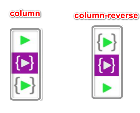
We can define flex-direction as either row or column. on the website when you use display: flex; by default direction will be row.
flex-direction: row;
Similarly
flex-direction: row | row-reverse | column | column-reverse;
row-reverse
column | column-reverse
flex-wrap
By default, flex items will all try to fit onto one line. You can change that and allow the items to wrap as needed with this property.
.container {
  flex-wrap: nowrap | wrap | wrap-reverse;
}
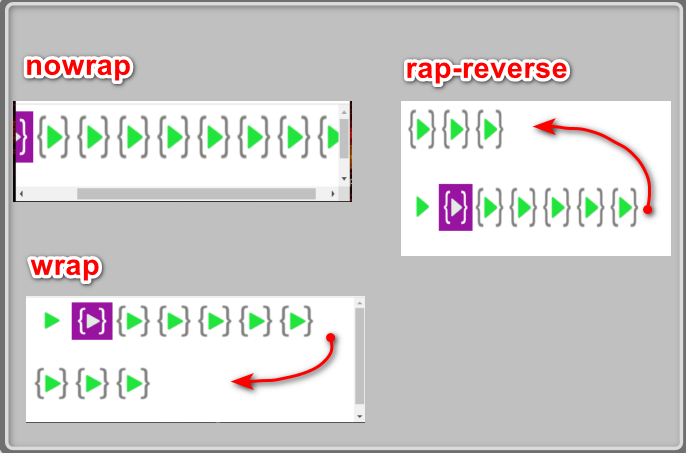
- nowrap (default): all flex items will be on one line
- wrap: flex items will wrap onto multiple lines, from top to bottom.
- wrap-reverse: flex items will wrap onto multiple lines from bottom to top.
justify-content
This defines the alignment along the main axis. It helps distribute extra free space leftover when either all the flex items on a line are inflexible, or are flexible but have reached their maximum size. It also exerts some control over the alignment of items when they overflow the line.
.container {
  justify-content: flex-start | flex-end | center | space-between | space-around | space-evenly;
}
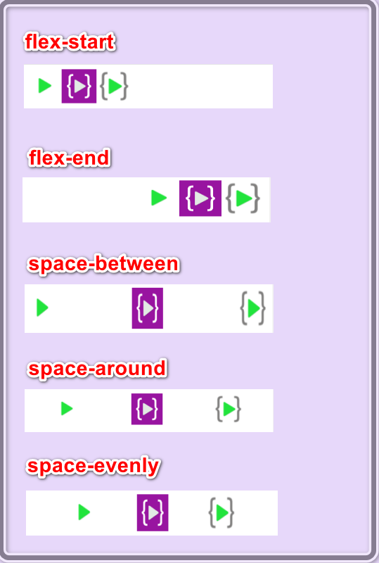
Other list of justify-content are below
- flex-start (default): items are packed toward the start of the flex-direction.
- flex-end: items are packed toward the end of the flex-direction.
- start: items are packed toward the start of the writing-mode direction.
- end: items are packed toward the end of the writing-mode direction. - left: items are packed toward left edge of the container, unless that doesn’t make sense with the flex-direction, then it behaves like start.
- right: items are packed toward right edge of the container, unless that doesn’t make sense with the flex-direction, then it behaves like start.
- center: items are centered along the line
- space-between: items are evenly distributed in the line; first item is on the start line, last item on the end line
- space-around: items are evenly distributed in the line with equal space around them. Note that visually the spaces aren’t equal, since all the items have equal space on both sides. The first item will have one unit of space against the
align-items
This defines the default behavior for how flex items are laid out along the cross axis on the current line. Think of it as the justify-content version for the cross-axis (perpendicular to the main-axis).
.container {
  align-items: stretch | flex-start | flex-end | center | baseline;
}
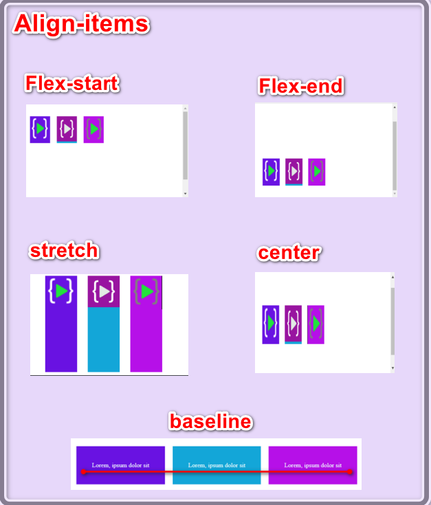
- stretch (default): stretch to fill the container (still respect min-width/max-width)
- flex-start / start / self-start: items are placed at the start of the cross axis. The difference between these is subtle, and is about respecting the flex-direction rules or the writing-mode rules.
- flex-end / end / self-end: items are placed at the end of the cross axis. The difference again is subtle and is about respecting flex-direction rules vs. writing-mode rules.
- center: items are centered in the cross-axis
- baseline: items are aligned such as their baselines align
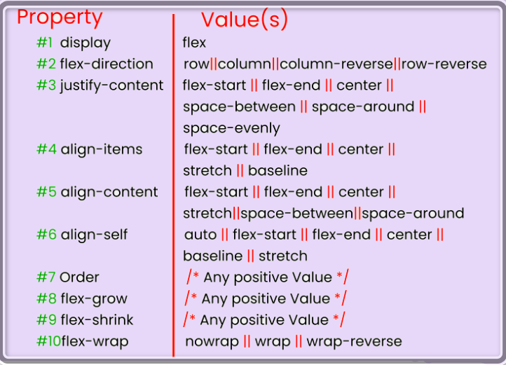
Flexbox Chart
This chart contains every possible property and value we can use when we are working with Flexbox. We can reference it while doing your projects and experiment with different values.